Managing Themes
The Theme Manager can be accessed from the navigation in the System > Appearance & Branding section. It opens with
a sidebar listing the available themes on the left and a theme editor on the right.
The Theme Sidebar
The sidebar groups the themes into two sections:
- System themes: the protected, built-in themes that are always delivered and cannot be deleted:
Pimcore Light: the light theme. Its branding is the coreAppearance & Brandingconfiguration (see The Light Theme Is the Appearance & Branding Identity below). It is editable but can never be deleted.Pimcore Dark: the built-in dark theme. It is editable but cannot be deleted.
- Custom themes: every theme you create yourself. These can be freely edited, duplicated and deleted.
Two passive badges indicate the current state of a theme in the list:
- the theme currently set as default for all users;
- the theme that is your current theme (see Per-User Themes).
Create a Theme
Create a new theme with the New action in the sidebar. You only provide a name in the dialog; the theme is then
created and opened in the editor, where you configure its token set and branding.
Open, Edit and Manage Existing Themes
Selecting a theme in the sidebar opens it in a tab in the editor on the right. Several themes can be open at once. A theme with unsaved changes is marked with a dot in its tab; closing a tab with unsaved changes asks you to confirm before discarding them.
Additional per-theme actions (such as renaming, duplicating and deleting) are available from the theme's context menu in the sidebar. Protected system themes cannot be deleted.
The Theme Editor
The editor is organized into tabs:
General
- Name: the display name of the theme.
- Description: an optional free-text description.
- Token set: the color scheme applied by the theme, chosen from the registered theme dynamic types (for example
Pimcore LightorPimcore Dark). Other bundles can add their own token sets, see Custom Token Sets. - Default theme: a switch that makes this theme the system default. It is applied when you save the theme, not the moment you toggle it. The current default theme cannot be switched off directly; the default simply moves to whichever theme you switch on next.
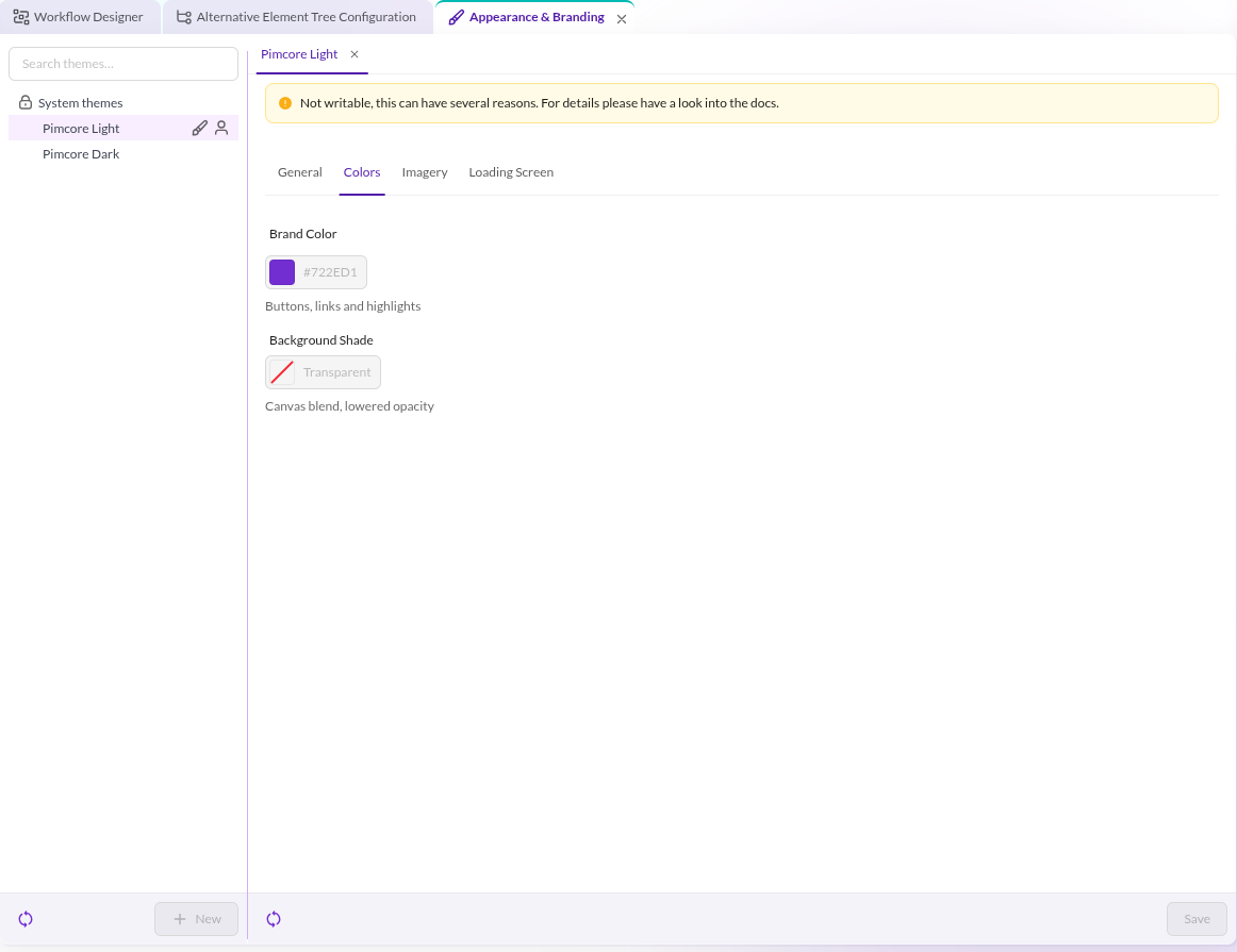
Colors
The colors tab holds the branding colors layered on top of the token set:
- Brand Color: the accent color used for buttons, links and highlights.
- Background Shade: the color blended into the canvas background at a lowered opacity.

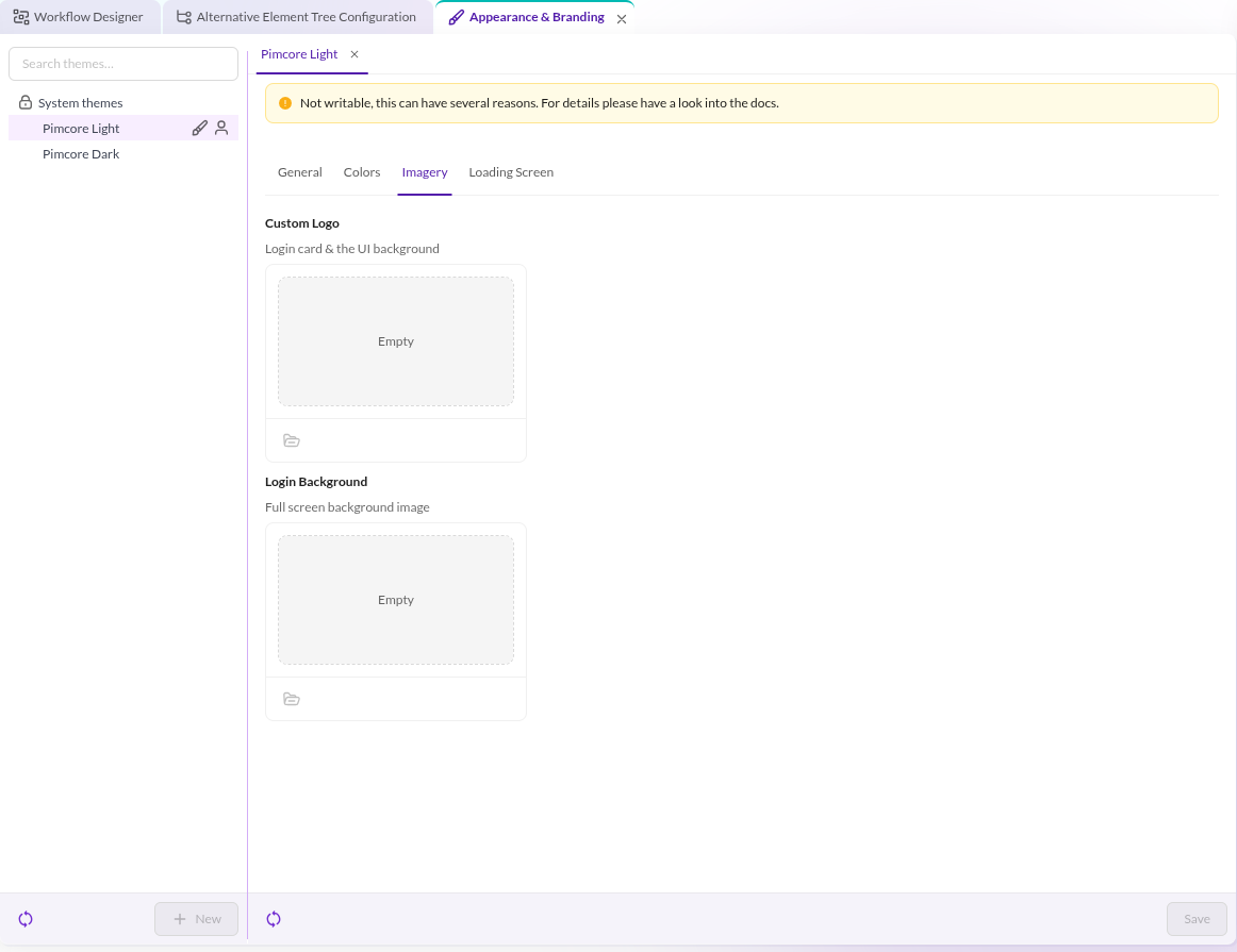
Imagery
- Custom logo: an asset used as the logo. The referenced asset must exist and you must have view permission on it. When no custom logo is set, the dark theme falls back to a bundled white logo.
- Login screen background image: an asset used as the background image of the login screen.

Loading screen
The loading screen tab configures the boot palette, the handful of base colors the server-side preloader paints before the Pimcore Studio JavaScript loads, so the loading screen already matches the theme:
- Page background: the background of the full-screen preloader surface.
- Logo orbit: the soft glow bubble behind the logo (accepts a color or an
rgba(...)value for transparency). - Soft bubble: the large neutral background figure.
When you leave the loading-screen fields empty, the theme falls back to the boot palette registered for its token set (see Boot Palette Providers).
The only editor action is Save. Saving persists the theme and, if you toggled the default switch, applies the new system default.
Theme changes are applied for new sessions only. There is no live re-theming: after changing a theme or the system default, reload Pimcore Studio to see the change.
Set the System Default Theme
The system default theme is the theme every user gets unless they picked a personal one. You set it from the Default theme switch on the General tab and it takes effect when you save.
Out of the box the system default is Pimcore Light, which is also the fallback if the current default theme is ever
deleted.
The Light Theme Is the Appearance & Branding Identity
The Pimcore Light theme is special: its branding is not stored separately but is the core
Appearance & Branding configuration. Editing the light theme's colors and imagery writes through to the core admin
settings.
Because the light theme writes through to the core Appearance & Branding settings, editing it changes the
appearance identity used as the ultimate fallback across the system. The write-through happens after the theme itself
has been validated and saved, and there is no rollback path for the core settings.
Delete a Theme
Custom themes can be deleted from the theme's context menu in the sidebar. The two protected system themes
(Pimcore Light and Pimcore Dark) cannot be deleted.